
Index
Words usually have the difficult task of transforming complex concepts into something simpler, more understandable and, sometimes, more concrete. As language evolves, however, there are Some terms are often used without fully understanding their meaning, which sometimes changes depending on the context in which we find them. This often happens with words imported from other languages or with neologisms.
È the case of the word brand: the complexity The technical concept and the English derivation of the term lead to considerable confusion about its meaning. From a theoretical point of view, a brand is a name, sign, symbol, design, or a combination of these, which aims to identify the goods or services of a seller and differentiate them from those of competitors. In short, it is the key element that represents a company and its characteristics.
This definition does not take into account the sphere of perceptions, memories, impressions, and feelings that are often associated with a brand. There are countless examples of large companies that have built their fortune by associating their name with that of daily actions or specific states of mind.
It is therefore difficult to find a definition that perfectly identifies the complexity of the concept of brand, but a synthesis that we particularly like is the one proposed by David Ogilvy, one of the most important creatives of recent years. According to Ogilvy, a brand is the intangible sum of the characteristics of a product. This definition struck us because it introduces a new level of analysis: the sum.
A brand, in fact, contains within itself various elements, often pertaining to different worlds. The brand is not just the logo that a consumer sees in an advertisement, but is It also includes the set of corporate values that guide the activities of its employees every day. The greater the ability to synthesize external perceptions with internal ones, the greater the effectiveness of a brand.
A comparison that could be useful to describe this concept is that of a physical person. In fact, a brand, like each of us, has an internal side and an external side. The challenge, often not indifferent, is to maintain coherence between the two worlds. This complexity increases in all those periods of growth or change, such as during adolescence, when we realize that, in some cases, we are not communicating to the rest of the world who we really are. And it is in those moments of growth, of maturation, that our roots become increasingly clear and a precise idea of the future develops. The awareness of being unique, different from those around us, brings out the need to make this uniqueness perceived by the rest of the world.
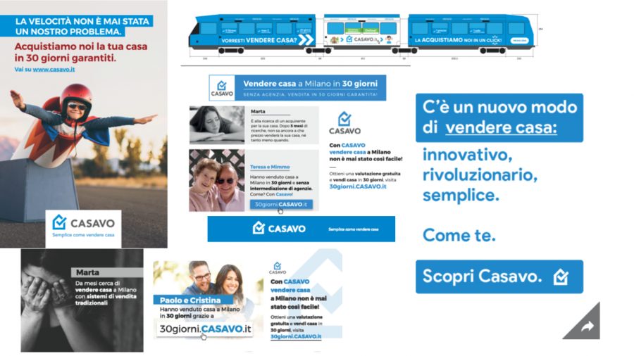
And this is exactly what is needed. success at Casavo in recent months. Just over 18 months ago, when our startup was born, the first goal was to create a unique reality within the Italian real estate landscape. This was reflected in the definition of some values and guiding principles for daily activities – right from the start it was clear who we were and what we wanted to become.
In the initial flurry of activity, there It was a question that was put on the back burner but which, month after month, emerged in an increasingly important way: are we sure that the rest of the world is understanding who we are and what we want to do?
And so, after long reflection, we understood that we were at that moment in life in which, after having grown and matured, one wants to reclaim one's uniqueness.For a company like Casavo, this translates into what, in technical terms, is rebranding, that is, 'changing face', developing a new image that is in line with the principles, values and history of our company.
In the past few months we have collaborated with the Walk In team to present to you, today, the evolution of our corporate image which, in continuity with the past, even better defines the identity by Casavo.
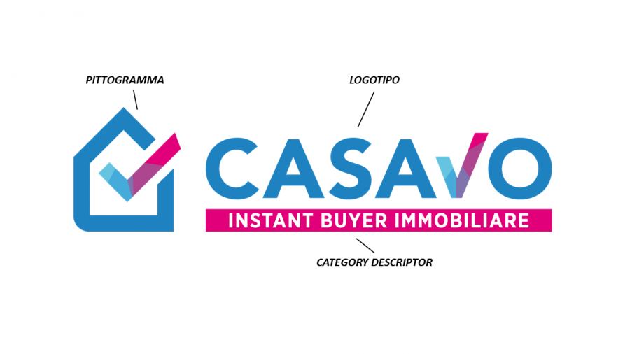
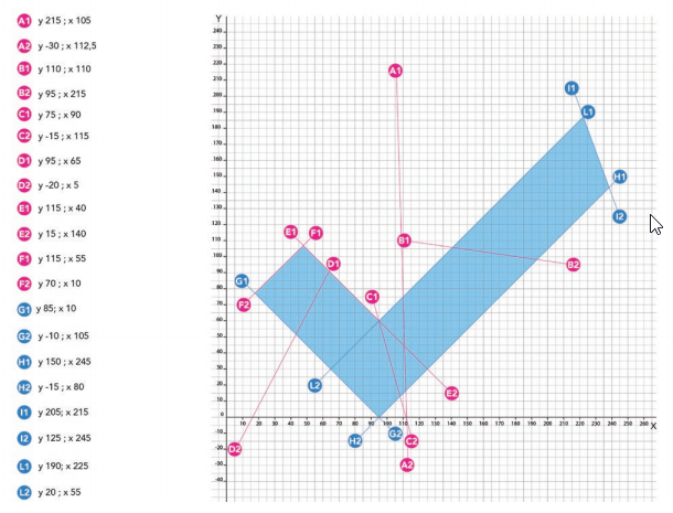
In doing so, we started from an element present in our old logo, the 'tick' of the pictogram. We believe this symbol could represent three key aspects of Casavo.
Certainty and security in all our activities
We are concrete, transparent, and precise, despite operating in an often complicated market. We want to offer our customers clear conditions and certainty in purchasing times. We want to guarantee stability and strong points of reference to our team. To our partners and suppliers, clear conditions and maximum availability in collaboration.
Concreteness in dealing with everyday life
At Casavo, the value of concreteness guides our activities. We like to be able to use facts as the basis for our decisions and our customers' needs as drivers for the growth and development of our business. In short, we like to focus more on the substance of things than on their form.
Speed in times
Working with Casavo or in Casavo means being sure that things always happen in the shortest possible time. In fact, we try to offer our customers a service that allows them to solve their problems quickly and our partners a collaboration to continue their business successfully.
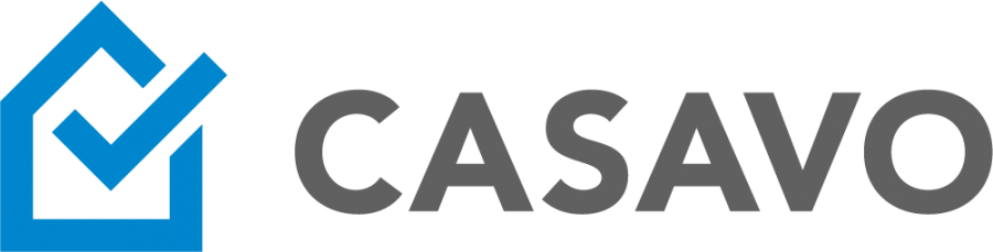
We therefore no longer find the “tick” not only in the logo pictogram but, due to its importance, it is also repeated in the Casavo logo, almost replacing the V. Don't worry, we haven't changed our name (and no, it isn't and has never been Casav!) but we wanted to reiterate our values once again.

The 'tick' is also important for another reason: it breaks the line of the pictogram's house, transforming the closed line into a broken line. This element has a very specific meaning that reflects our identity: we are innovators and, by definition, we are open to stimuli from the outside world. This openness, as anticipated, translates into the desire to intercept the needs of our customers and start from these in defining the development strategy for the future. Casavo was created to offer a solution to the typical problems of a real estate sale and will continue to do so. to act as a market facilitator, with different forms but based on the same philosophy.
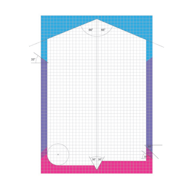
An absolutely new element is the category descriptor, that is, the horizontal box bearing the words “Instant Buyer Immobiliare”. This choice stems from the fact that the birth of Casavo, in 2017, also marked the birth of a new category of players in the Italian real estate market, which did not exist before then: the Instant Buyers real estate. This graphic element, which accompanies the logo and pictogram, clearly identifies our role in the creation of this market category. Likewise, it reiterates the revolutionary concept that distinguishes us: in a market dominated by intermediation or listing portals, Casavo is the first and only large-scale direct real estate buyer.
In addition to the shapes, the colors also change that will accompany our reality; from today onwards. The blue that characterized our brand has evolved into 6 different colors, which make up the different parts of the logo. The chosen colors not only place us in clear discontinuity with the typical chromatic palette of the traditional real estate market, characterized by shades such as green, blue and red, but they also represent the new nuances of the sales experience introduced by Casavo.
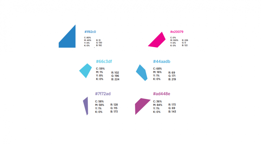
The characterizing colors of the new image are cyanand magenta. These shades They derive from the synthesis of some primary colors: cyan is generated by mixing green and blue, while magenta from red and blue. This is the synthesis of the typical colors of the real estate sector. Casavo's experience is therefore a synthesis and an evolution of the market, which offers new perspectives and nuances.
As we have told you, the new corporate image stems from a profound reflection on our reality, our strategy and our maturation. This change is not intended to erase our history, but to better communicate the characterizing elements of our reality. Our goal is to make the Casavo philosophy even clearer and more transparent, telling our customers about our mission and our passion for innovation.
This new image will be used across all our communication channels and will represent our brand in the coming months and years. As you can see, our website has also changed its look, thanks to the work carried out with Muratori Terzini. Now it's your turn to let us know what you think!