
Index
Think you know all the tricks of matching colors for clothing and makeup? So take another step forward and discover the secrets of color harmony in interior design to give your home a look in harmony with your natural palette!
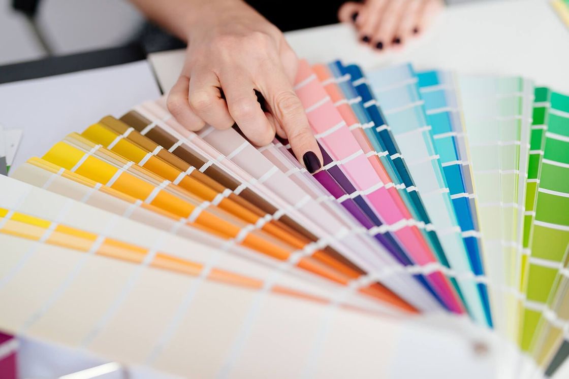
How to decorate your home with color harmony
color harmony is the discipline that studies a person's somatic characteristics and identifies the most suitable color range to combine to enhance their external features. Based on your eye, hair, and skin color, you can then receive a series of suggestions on the shades that are best suited to enhancing your appearance and showcasing your personality.
The palette of recommendations you receive helps you understand which colors to choose for clothing, accessories, and makeup to enhance your image. This science, however, not only aims to make you look your best, but also to help you find a greater balance between your appearance and your inner identity. In this way you can project your true self and express yourself with complete freedom.
According to color harmony, each person can be associated with four color seasons:
- winter
- autumn
- summer
- spring
Each period is then divided into different shades defined with adjectives such as absolute, deep, soft, cool, and light. Each of these classes corresponds to a palette made up of warm or cold, intense or delicate nuances.
On the web, you can find many different tests to try to understand if you are winter or summer, spring or autumn. For a more precise evaluation of your natural colors, however, we recommend that you have a specialized consultation that will allow you to understand every detail of your ideal look. The analysis is based on the study of the dominant tones of skin, hair, and eyes, and from there the ideal category into which you fall is identified.
To combine color harmony with interior design, you will then have to adapt the palette that is recommended to you in your home furnishings. Here are some suggestions on how to do it best season by season.
Color harmony and design: find out which season is right for you
Color harmony in interior design involves the use of color palettes designed to enhance your complexion even in the home environment. The home thus transforms into an external expression of your characteristics to fully and completely express your personality.
The colors that represent the season to which you belong thus become the protagonists of furniture, fabrics, and details in a harmonious and coherent context. Let's look together at the peculiarities of each period to bring color harmony into interior design.
Winter
The winter season is characterized by high contrasts that include light complexions and dark hair. Winter people have skin that tends to redden easily and has difficulty tanning, bright eyes, and hair that ranges from bright ash brown to raven black.
The colors that accompany winter are generally cold and very bright. So, blue, purple, burgundy, silver, emerald green, and yellow in its most acidic shades are good. However, it is black that represents the emblematic color of the category.
If it's winter, don't be afraid to add the elegance of black to your home decor for an overall result of great refinement. In this palette, however, we recommend excluding all warm shades.
Autumn
People who correspond to this time of year are characterized by warm tones with a low level of contrast. A classic example is those with dark hair, between brown and dark brown, an olive complexion, and brown eyes.
The shades suitable for autumn include saturated tones that are inspired by the earth and nature such as:
- yellow
- ochre
- red
- brown
- dark green
and all the shades from peach to orange. When furnishing your home, we recommend leaving plenty of space for natural wood with parquet floors and Nordic and Scandinavian-inspired furniture. Furthermore, our tips on how to decorate with warm colors may be useful. The enemies of the autumn palette? Pastel shades.
Summer
The colors we usually associate with summer are rich and full, full of references to the sun and brightness. According to the dictates of color harmony, this season actually includes a wide range of cool blue and green tones, such as aquamarine and sage shades, as well as lavender, sand, powder pink, and gray.
The characteristics of a summer person include a cool complexion, dull and with low contrast. These characteristics are accompanied by light blonde to ash brown hair with dull blue or green eyes.
In interior design, summer is expressed with soft and delicate colors. pastel shades for furnishings are therefore particularly suitable, while it is best to avoid any warm tones.
Spring
If you have a bright and saturated complexion with bright overall colors and an overall contrast between medium and high, then it is very likely that you fall into the spring category. The palette includes bright, warm, and light tones from azure to blue, from antique pink to coral, from mint green to apple, and many shades of orange.
In a home, this color range translates into bright, intense, and brilliant colors. An orange wall is a great way to convey your seasonal identity on the living room walls. Pair it with white elements and light wood furnishings to reconcile color harmony and design. It's best to avoid gray and black, however, as they don't fit in with the spring palette.
Being able to bring color harmony and interior design together helps you design a home that fully represents your personality and look. Once you've identified the season you belong to, all you have to do is follow the advice you've just read to bring a wave of color into your home decor. The first step, however, is to find the right place to express yourself freely: hundreds of properties await you, ready to transform into your favorite season!


