
Index
Discreet, relaxing and bright, the sugar paper shade for walls is perfect for giving any room in your home a calm and welcoming atmosphere. To unleash the full potential of this increasingly popular and trendy color in interior decoration, however, it is important to choose the right color. It is important to match it with colors that enhance its main characteristics. In this article, we at Casavo will help you find the best solutions for your combinations.
How to match the sugar paper color of the walls
The exact chromatic point of sugar paper is obtained by mixing together white, gray, and blue. From the encounter of these three shades, a light and delicate nuance emerges that lends itself to many different combinations. Its simple and luminous versatility makes it suitable for adding nuances that are both refined and vintage to any type of space. Here are some ideas on how to match the baby blue color to the walls.
Tone on tone with blue
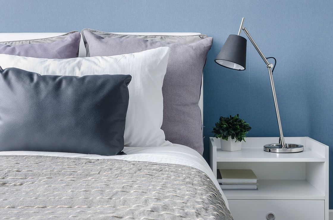
This color is very suitable for decorating the walls of rooms dedicated to rest or concentration such as the living room, bedroom or study. To achieve a completely relaxing effect, we recommend choosing furniture in shades of blue, light blue and light blue. With these three options, you work on shades that are 100% compatible with the color chosen for the walls to create an environment that is immediately welcoming to those who enter the room.
The shades obtained from blue are especially suitable for combining a living room with baby blue walls, to make your guests feel at ease even before they sit on the sofas. If you want a trendy touch, also treat yourself to a detail in Very Peri, the Pantone 2022 shade, in perfect palette with baby blue.
A different use of purple based on the shades
Purple is also excellent for picking up the vein of blue present in baby blue. This color, especially in its brighter shades, however, risks being demanding and tiring to the eye if used without the right measure. Our recommendation, therefore, is to adopt it only for a few details. È very suitable, for example, for quilts and cushions, or in its bright version for a single vase that stands out from everything else.
The light points of the purple chromatic range, especially its pastel shades, are instead perfect for bringing a refined air of tranquility to your rooms. Try a lilac shade for curtains with baby blue walls and you'll see what a beautiful mix!
A vintage effect together with yellow
The baby blue color on the walls also has the ability to to transport your home back in time to atmospheres reminiscent of certain interiors from the 1970s. To enhance the vintage note, add furnishing elements in a beautiful mustard yellow or ochre, two shades particularly suited to details such as vases, plates or cups.
A vein of intense yellow, on the other hand, is what you need if you're looking for a pop and lively thrill that stands out against the sugar paper of the walls. If you dare, you could also risk a surprising fluorescent yellow armchair to interrupt the sobriety of the living room.
Classic and modern style with pink
Pink combined with the sugar paper walls combines classicism and modernity and is especially suitable for bedroom furnishings. The union of these two apparently cold colors generates a soft sensation of well-being that relaxes the senses and soothes the nerves. Our advice is to choose delicate shades such as powder pink or antique pink, very elegant and always in fashion.
Gray, the elegance of simplicity
To stay on the theme of combinations that are both classic and modern, combining it with gray creates a solution of guaranteed elegance and great refinement. The light and neutral shades of gray, for example those tending towards dove gray, create a sensation of movement together with baby blue. The dark versions of this color such as anthracite, on the other hand, acquire luminosity thanks to the color of the walls.
All the variations of green you want
Green in all its variations pairs beautifully with baby blue in many different ways. aqua green enhances the relaxing notes, while emerald green with its shine adds a whimsical touch. A dark color like petroleum green, with its percentage of blue that pairs well with baby blue, brings refinement only to the austere appearance. A suggestion? Try a beautiful forest green on a single wall.
The lightness of orange
In addition to being a unique choice for the walls of your home, orange is suitable for different combinations with baby blue. The combination of the two shades can give every room in your home a fun and unexpected look: just don't overdo it. In its richly saturated shades, orange also adds a sophisticated note.
Now that you know how to match the baby blue color of the walls, all you have to do is find a home to start experimenting with combinations and contrasts. On the Casavo platform, many listings with quality photos await you. to carefully study your next home before even visiting it.


