
Index
Home furnishings can be a source of worry and difficulty, especially when it comes to choosing the right combination of furniture and coverings.
Just when you think you've found the right path, doubts and uncertainties resurface. But, even when you fear you won't be able to navigate the dozens of possible palettes, sit down and breathe deeply: it's less complicated than it might seem.
Meanwhile, since they will be the protagonists of this article, let's start by giving a face to the warm colors for furnishings: they are all shades of red, orange, and yellow, and they convey joy, strength, passion, and proactivity. They are used together with dark wood — parquet and furniture — to make your living space convivial, welcoming, and comfortable.
Your home has a soul and is in the color you prefer, ready to welcome with discretion or amaze with special effects. Looking for inspiration? Take a look at 10 Casavo tips on how to decorate your home with warm colors.
1. Warm colors for furnishings: let's start with the walls
Colorful walls are beautiful, it's true, but they tend to tire the eyes over time. When it comes to warm colors, the risk of making a room in the house "hot" is just around the corner: we're talking about rather strong hues that are best measured out before using them on such large surfaces.
Red, for example, is a color that adapts well to rooms reserved for welcoming guests of small dimensions, such as the entrance hall and the living room. It is synonymous with joy and passion but should be toned down with furniture in neutral tones or, at most, with wooden furnishings capable of bringing out the ethnic nuances of this color.
As for orange, which expresses positivity, it is recommended for children's bedrooms, the kitchen or work environments, due to the good mood it instills.
And then there are the 50 shades of yellow: from straw to yellow ochre, passing through pastel tones, it seems to stimulate the appetite. The kitchen and dining room, therefore, are the rooms in which it is most used.
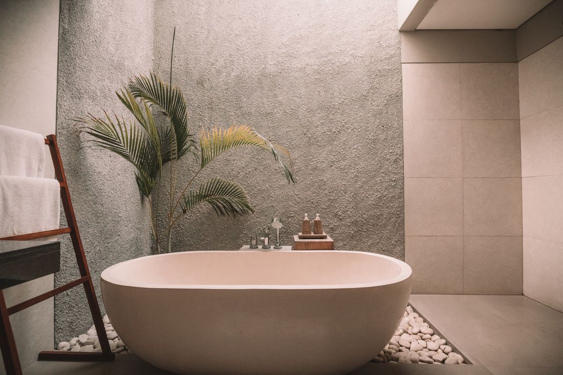
brown deserves a special mention, which, although not officially included in the palette of warm colors, is considered one of them: perfect for bedrooms - it is synonymous with comfort! – and for living rooms, elegant and welcoming.
2. Furnishing with warm colors: pay attention to combinations
Once you've chosen the color of the walls, you need to decide on the color of the furniture, accessories, and decorations. How do you combine warm colors? Here are our suggestions:
- orange and white;
- ochre yellow and brown;
- dove gray and chocolate;
- brown and gold.
White goes well with everything, as do beige, cream, and cream: these neutral tones serve to soften the more impactful ones and make rooms more elegant.
If, on the other hand, eclecticism is your distinctive feature, play with strong contrasts: blue and red, red and yellow, red and pink, red and purple. But be careful not to overdo it: kitsch hasn't been in fashion for a while.
3. Warm colors in the living area
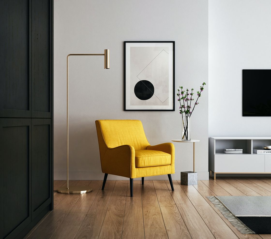
Energy and a desire to get things done: these are the key words that hover in the area of the house where you undoubtedly carry out most of your household activities. In trade magazines, among the tips for modern furnishing with warm colors, you'll find dozens of photos of living areas painted yellow.
You can use it for the walls or, if you don't want to overdo it, to brighten up the furniture in a neutral room. A unique and creative idea, however, is to use pastel yellow for curtains and upholstery, contrasting with baby blue.
4. And in the sleeping area
Before talking about how to furnish the sleeping area with warm colors, know that the effect of colors on our mind is truly powerful. Chromotherapy deals with determining which moods certain colors evoke and how they can influence the decisions we make throughout the day.
Red, orange, and yellow are energetic and passionate, therefore less suitable for stimulating the relaxation you seek when putting on your pajamas. In the bedroom, it's better to opt for chocolate or caramel combined with white textiles.
If everything seems too dull, alternate neutral colors with some strong hues for small furnishing accessories.
5. Modern furniture and warm colors
Until recently, when talking about modern furniture, we always ended up mentioning the classic color contrast between black and white.
This trend, however, has been superimposed by a new one that sees warm colors alternating with neutral tones that recall natural materials: the aim is to create an environment that inspires serenity and, at the same time, sophistication.
6. Powder pink: the warm color of 2021
Among the most fashionable shades of the moment, powder pink can be a valid alternative to chocolate, especially for the walls of the bedroom. Whether the space is very bright or not, the pastel nuance with a touch of beige is a great choice. it will warm the environment giving it airiness and harmony.
The real gem? Choose it to modernize a bedroom furnished with antique, dark furniture.
7. Natural light loves coral
The color coral, if used well and in the right measure, can give your home that touch it needs to make it a little pearl of design. This shade of red, in fact, is an interesting attention-grabber - and light! - capable of drawing attention to the most refined details of the furniture.
Remember, however, that it is still a bright color: choosing it in the form of matte paint will save you from the cartoon effect which, in the long run, can be annoying.
8. Salmon? Very chic!
Not a fan of red and orange makes you turn up your nose? Salmon is the right shade to elegantly furnish the rooms of your home.
This particular color nuance, halfway between bright red and orange with a hint of pink, is the ideal solution for the walls of a classic-style living room, perhaps with crystal chandeliers and Gauguin reproductions.
9. Yellow and gray: the perfect mix of warm and neutral tones
Yellow and gray are the perfect pair, destined to last forever: the Pantone Institute says so, electing it the best color pair of 2021, and not only that. Apparently, the duo is the favorite of architects who mainly deal with kitchens.
Having breakfast leaning against a lacquered yellow peninsula seems to be a daily action capable of providing those who do it with the dose of energy needed to start the day well. Shake everything with a touch of gray and balance is guaranteed.
10. Terracotta for every style
Although it is very intense, traditional terracotta adapts well not only to our warm color palette but also to different furnishing styles:
- it dresses up a classic apartment;
- it adds a Mediterranean touch to urban lofts;
- it energizes industrial furnishings.
Our advice? Pair this color with modern furniture, such as Scandinavian style, for example, adding vintage pieces, wicker elements, or industrial-style details here and there.
Now that you have some good ideas on how to decorate your home with warm colors, it's time to look for the perfect home to host your interior design project. On Casavo's advertising platform you'll find the best real estate listings of the moment: the apartment you've always wanted could be right there. Good luck!


